

During winter nights, when the street lamps cast variously colored light on the landscape, it is very different to be "true" to the way the human eye sees the landscape. One option is black-and-white, but that is also different from the eye.
How do you feel about this? Is it acceptable to select the color balance according to the photographer's artistic instinct, or should one use some kind of "normal" setting? (Whatever that is.) Or then not to take any photographs where there are such potential problems.
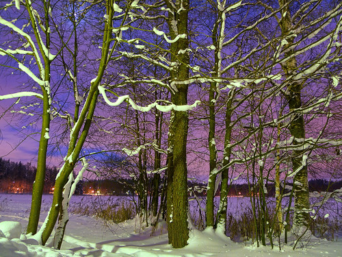
Here are three examples, taken today and yesterday.


Son métier lui plaisait bien.
15 hours ago
6 comments:
Really like the first one!
Curious question: are the skies really as colourful as they look on your photos or are you doing some manipulation to achieve that?
Excellent question! The skies are colorful, but the colors you see depends on what is the surrounding "color landscape" to which the eye has adapted.
Also, the colors of the sky are less bright due to the fact that the eye is usually halfway between day vision and night vision (black and white). With a long exposure, camera sees much better in the dark than the eye.
I do a little bit of tweaking with the color balance, to get rid of the orange tint for example. In this way, the photograph is closer to the way the eye sees the landscape, as it doesn't usually see the tint of the artificial lights.
I don't think there is a 'right' answer to this except for news reporting.
For 'accurate' reporting it is important not to disguise reality more than a photographs always does anyway.
I have two examples that come to mind. One is at the beginning of one of Richard Attenborough's films set in the townships in South Africa - it may have been the film 'Cry Freedom'.
I remember the camera making the township look so inviting, the smoke curling up from the early morning cooking fires, and probably very different from the experience of living there.
The other example is Michael Woods' series about India. The film crew must have put a warming filter on the lens - everything looked so golden.
But in general, I look at images for the image - and I am not concerned whether the photographer was trying to represent reality. If it looks better warmed up or the color balance changed, then that's fine with me.
I think it comes down to how good the individual is at changing things, and you make really good changes.
As a final thought, do you remember how digital images seemed to you when you first saw them some years ago? I think our perceptions and expectations have changed and we cannot go back to 'un-imagine' how things used to look to us.
@David: Excellent examples. I guess it is a matter of taste, and of interpretation.
One Finnish newspaper photographer comes to mind, his trademark is darkening the corners and pushing the saturation, to such a degree that he has his own "look". But most of his photographs are also well made, good composition, interesting viewpoint etc.
For me one of the best answers is, to point you to Bob Krist's recent promotion image for the new Nikon 16-35/4 VR. See here for an image that has been shot with Tungsten white balance and an orange gelled flash for the foreground. The result is awesome. No Photoshop tricks involved, but of course there is no similarity to what has been there. He has shot the same scene with the new 24/1.4, and this time without flash and with a natural white balance.
Now tell me: where is the fundamental difference between using a camera setting (or a film designed for tungsten light!) and setting colors in Photoshop? Well, one difference is obviously there, for Bob Krist's method you need an assistant :)
@Andreas: Excellent examples, it is not often you see such a pair of photographs so different in light yet so good.
Post a Comment