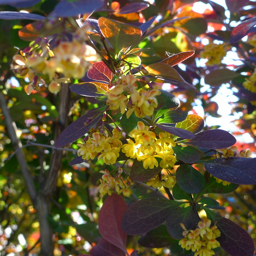
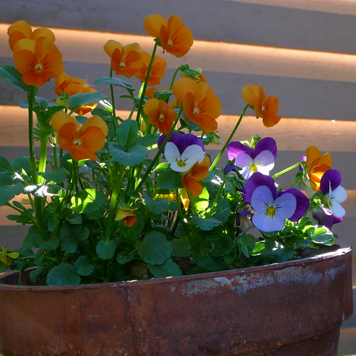
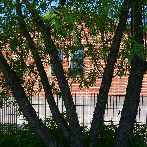
I did some further exploration of the square format today, trying to learn what works and what doesn't. I'm not sure whether I made any progress, but here are some samples. Thanks to the format being built-in to the LX3, it should be easy to compose in this format. But it isn't.
May Day
20 hours ago


2 comments:
My default image style is [natural] colour + 4:3 aspect ratio.
Occasionally in post-processing I crop to 1:1 or edit to B&W ("crop out the colour") if the image doesn't work as taken.
I don't go looking for 1:1 or B&W but sometimes the images work out better that way. I feel more comfortable with this approach, rather than trying to force images to 1:1 or B&W or go looking for them before pressing the shutter button.
I agree with your point - but I think I need to limit myself for some time to one viewpoint, to develop skills in that, which may be later of use when doing cropping to 1:1 format.
Post a Comment