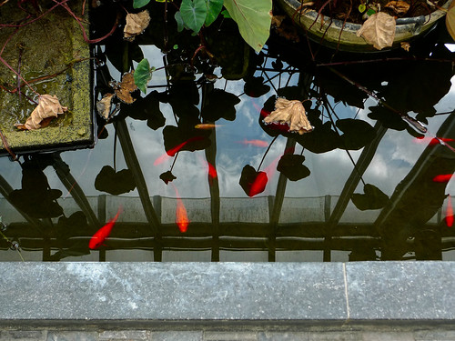
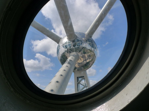
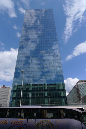
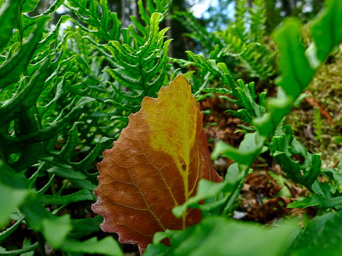
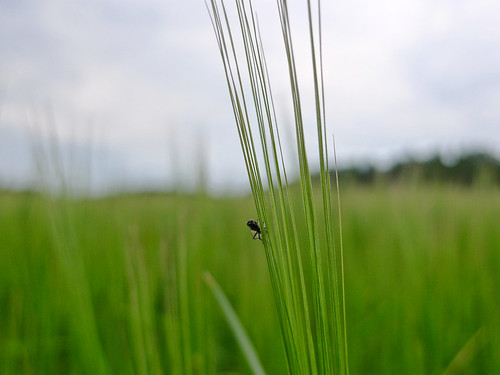
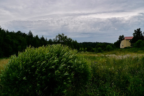
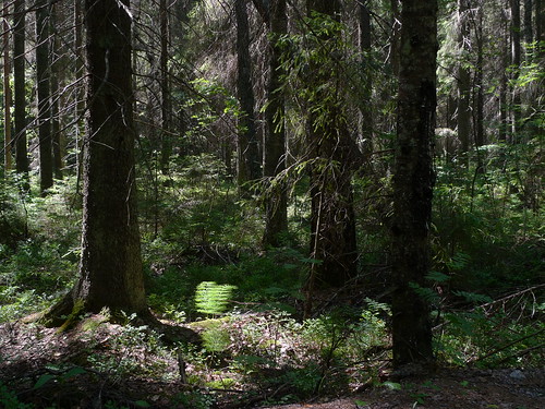
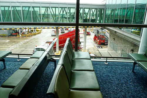
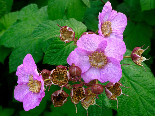
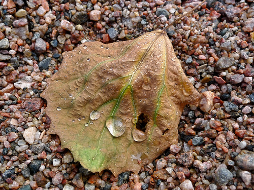
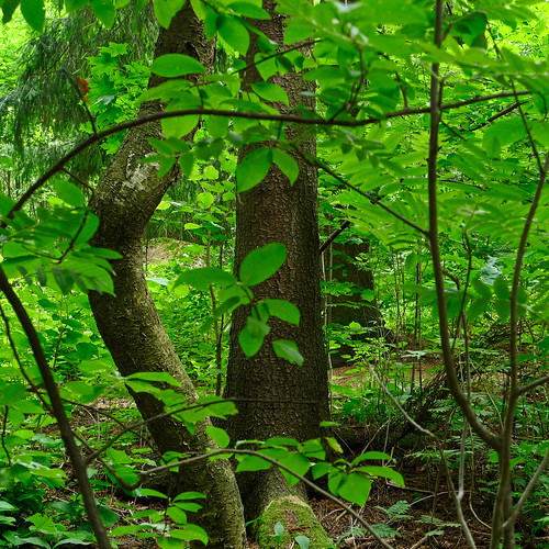
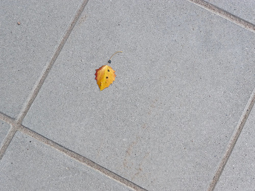
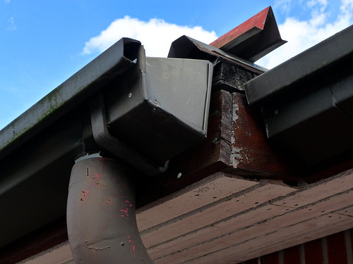
Here are three images of Brussels. All are quick snapshots take as a tourist. It is (for me) very difficult to take good photographs in an unfamiliar place, and Brussels was no exception. Brussels was in some parts surprisingly dirty and smelly, but there were also shiny new bits.
Update: I realized only later that the waterway through Brussels which I thought was a river is in fact the Brussels-Charleroi Canal. The river Zenne/Senne has been covered up underground since long time ago, because it was so polluted. But there is still a certain smell around Brussels, though. And it seems that many old buildings are not taken care of properly either, which is a big contrast to the big fancy glass and steel buildings which have been build recently.
Thursday, July 30, 2009
Tourist views of Brussels
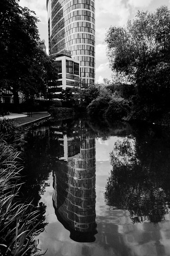
Brussels in b&w
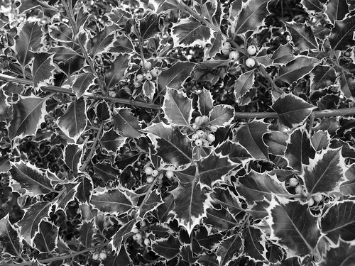
Here are two b&w photographs taken in Brussels a couple of days ago. I had a negotiation meeting with the European Commission, and took the opporturnity to see a bit of the city at the same time. Another posting (in color) follows...
Saturday, July 25, 2009
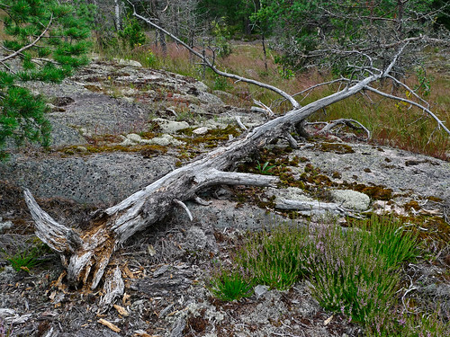
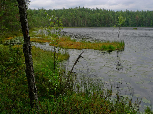
Dry and wet places in the Nuuksio national park
As promised, here is a second posting from today, a photo story of our walk in the Nuuksio national park yesterday. Four hours of walking, it was a great day for looking at the scenery. Next there will be a pause of few days or a week in blogging. See you then.
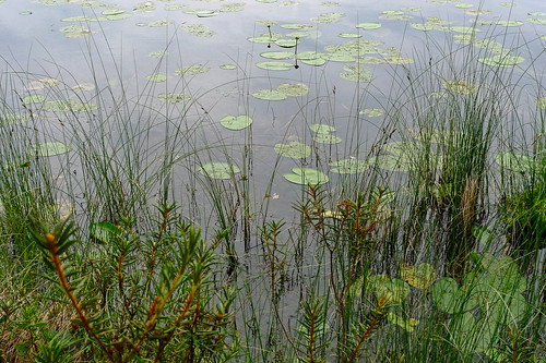
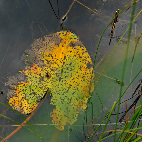
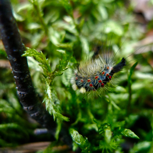
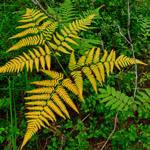
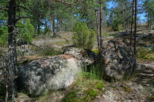
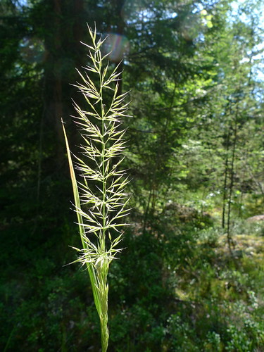
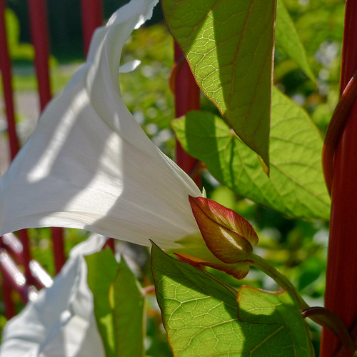
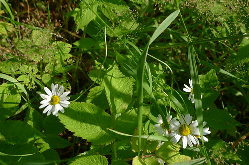
Three squares
Once again, I have been experimenting with the square image format. Here are three such photographs, all taken yesterday at Siikajärvi, west of the Nuuksio national park.
I'll make a pause of several days or perhaps a week in posting here at Light Scrape. So, to compensate, I'll make another posting later today.
Friday, July 24, 2009
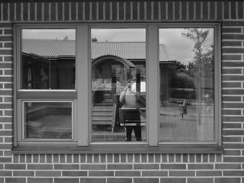
Portraiture in b&w (with windows) - LX3 dynamic b&w mode
I have looked at many b&w photographs during the last days - thanks to reading the books "The Photographer's Eye" by John Szarkowski and "Why People Photograph" by Robert Adams. And so I felt the need to take b&w photographs, at least a few, to find out whether it is possible to "see" in b&w.
As I have noted earlier, I usually see first colors when trying to take photographs, so b&w doesn't come naturally. On the other hand, b&w is more abstract than color, and this does suit my style of photography, so I guess I'll continue making these experiments. The "dynamic b&w" mode of the LX3 helps, as you get a nice preview of the image on the screen, educating you about the possibilities of b&w photography.
I haven't done many self-portraits, and this image is not precisely one either, but I felt it was a fitting subject, as I have been painting window panes during the last week or so. With triple glazing there are a lot of panes to tape and paint. As someone noted on the net, "Have you ever tried to paint [...] window panes? It is awful. ... Taping is also for amateurs and also takes for ever."
Returning to photography books, I have now finished reading the essay collection "Why People Photograph". It was a great book, though suprisingly much of the text focused on environmental and economical issues - the destruction of the America as it used to be.
I wrote here about everyman's right, and Robert Adams points to this topic. It is not so in America as it is in Finland (or Sweden), "where any citizen at all can walk to within sight of any house". Our rights to nature seem to be a kind of utopia Adams was planning towards. Sadly, I don't think things will soon improve in places where the rights of the public have been overriden by the rights of industry.
Another interesting thing was how Adams praised Szarkowski as a critic and curator of photography. And I feel the same. I'm currently reading another book of Szarkowski, "Looking at Photographs: 100 Pictures from the Collection of The Museum of Modern Art". An excellent review of photography!
Wednesday, July 22, 2009
Everyman's right
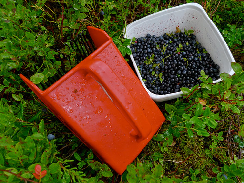
In Finland (but not everywhere else, sadly) there exists so-called "everyman's right" (also known as "freedom to roam" or "right of public access to the wilderness"), which means that you are free to walk in forests whoever owns them. And this right also includes picking berries (and mushrooms) in the forest. Anyone can do it. And if you sell the berries the earnings are free of income tax. This can be a nice additional income. I know this from personal experience in my youth when I was studying.
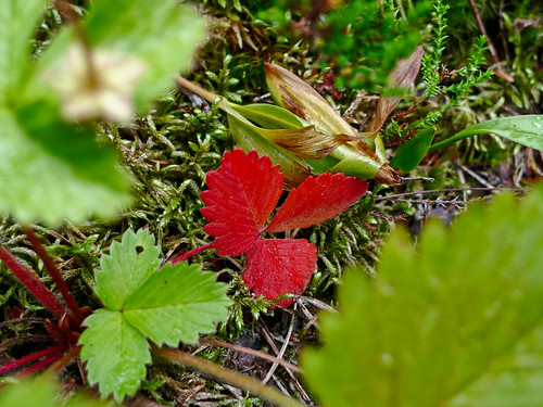
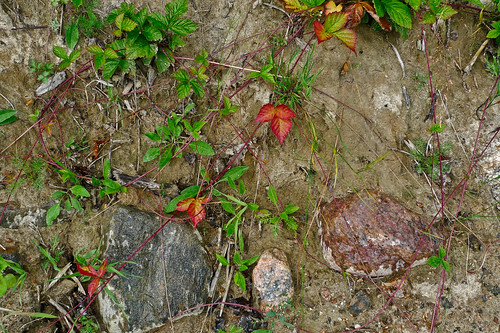
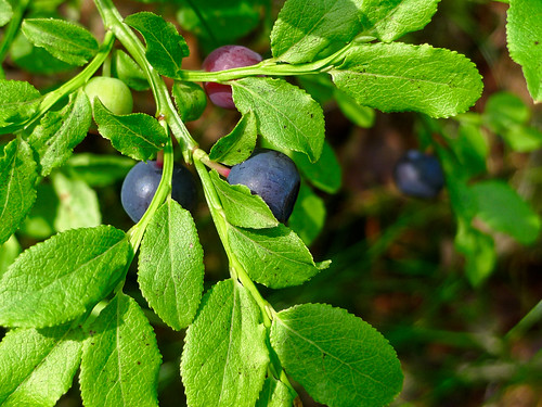
Here are three images taken (or perhaps made) today. Our freezer at home is full of blueberries and strawberries, but today we had one more trip to the forest to pick blueberries (and some wild strawberries). It was a wet day, but it didn't rain too much to spoil the excursion.
I have finished reading (or more exactly, looking at) the book "The Photographer's Eye" by John Szarkowski. An excellent collection of classic b&w photography, a lot of the photographs taken by unknown photographers. There were only a few pages of text, mostly the book was photographs, which is good. The book was divided in five parts, or aspects of photography: The Thing Itself, The Detail, The Frame, Time, and Vantage Point. And excellent introduction to the "seeing" of photographs.
Now I'm reading "Why People Photograph" by Robert Adams. This is a book of essays, with only a few images in the book. Here are two nice quotes: "For photographers, the ideal book of photographs would contain just pictures—no text at all." "... the best way to avoid talking about the pictures is to talk about their subjects—tract houses or fields or any to the myriad and interesting details of life."
The latter quote leads easily to the questions: What/why should photography blogs discuss? Should there be any text at all? Should they only contain images? And if text is needed, why? (I guess: because of the companionship.)
Update: TOP posted their review of the Olympus E-P1 interchangeable lens camera. An excellent review, focusing on the use of the camera in practise.
Tuesday, July 21, 2009
Colors of the Finnish flag
Did you know that the colors of the Finnish flag are blue and white? Well, that is the theme for this pair of photos (and the last pair in the series). Also, Finns like nature and sports, so the pair of images fits the theme in content also.
Update: Today I received a bunch of books on photography, ordered from Amazon. The book "The Photographer's Eye" by John Szarkowski is excellent. I have found pointers to the book in many places, but now that I have the original, I must say I'm still impressed. It is good to know how photography was born - "whole" - and how it has been growing around the center in all directions.
Wet and beautiful
Here is another in the series of two photos, theme is red (and some other stuff). Wetness makes the colors once again.
Rain makes colors
It has been rainy here in Finland during the last few days. So, to celebrate rain, which is a photographer's friend, here are three sets of two photos. This is the first one, theme being yellow/green.
Monday, July 20, 2009
Panasonic LX3 - pocketable photographic magic box
I have had the LX3 for ten months or so now, and it has been a great little camera. Pocketable, so you can carry it everywhere. Versatile, from close-ups to portraits to landscapes. Fine, in terms of image quality.
Here are two images from yesterday. Both were processed slightly in Lightzone to make the images appear as the eye saw them.
There have been recently more and more rumours of a follow-up to the LX3. It is said to have a (slightly) bigger sensor - 1/1.3 inch - producing better high-ISO capabilities. Well, you can always wish. Meanwhile, I'll continue taking photographs with the LX3.
What kind of successor would I like to have to the LX3? Well, there seem to be two alternatives. The micro 4/3 cameras such as E-P1 are promising, but the E-P1 is still a bit too large for me. Perhaps a fixed-lens version will appear soon, with a nice wide-angle lens to go. Another possibility is an upgraded LX3, and the rumour I pointed out above seems excellent for me.
I have used the LX3 at ISO 400 (and even ISO 800), but for my type of photography - landscapes - the graininess starts to be disturbing, because the texture of the landscape disappears easily to noise. Thus, clean images at ISO 400 (and perhaps even at ISO 800) would be excellent to have. (Because I'm shooting jpeg, I'm at a slight disadvantage here. If I were shooting RAW I could eliminate noise in post-processing better than the LX3 is able to do in-camera.)
But then there is the other side the picture, namely the usability of the camera. Here the LX3 shines, dispite one or two quicks, such as the easily turning mode dial and the easily opening battery compartment. The on-screen display is excellent, including a live histogram, which helps in getting the correct exposure. And then it is up to the photographer to catch the image he/she really wants.
Saturday, July 18, 2009
Doing a photowalk (but not a Photowalk)
I guess today is the day for worldwide photowalk. I didn't join, but at least I had a walk with the family, and took some photographs. Here are three of them. It was just after noon, the temperature was at 25 °C or above, and it was very bright.
Update: Thinking on this, I'm not sure whether taking long walks is a good reason for photography, or whether photography is a good reason for long walks. But both are excellent reasons.
About hade, shibui and jimi - note to myself
If you haven't read it already, check out the posting on hade and shibui by Mark Hobson. Pointed style as always, but contains good ideas. And there is an excellent comment by Andreas Manessinger. I haven't understood 1/10 of the stuff Mark and Andreas are writing about, but at least I got a handle on the stuff for future pondering. Perhaps 3-6 months from now on I may understand a bit more of the stuff they are writing about.
The photograph shown here was taken today at lake Siikajärvi. (And I have no idea whether the concepts of hade, shibui and jimi apply to the image at all.) It was a very sunny and warm day. More about this in a separate posting.
Friday, July 17, 2009
Summer landscapes
Here are two photographs from this week. Summer is progressing, and there is so much things happening in nature that it is hard to keep track. Lots of sunshine during the last few days - good vacation time, enjoying the bright Finnish summer.
Wednesday, July 15, 2009
Middle of summer
Here is a photograph from yesterday, which was a sunny and reasonably warm day. I did some painting - with one color, for the window frames - and had a late evening walk outside.
Monday, July 13, 2009
Rainy day
Here are three images from today: it was a rainy day. And there is a lot of green out there.
Flowers and blueberries
Here are two photographs from the weekend. Blueberries are getting ready for eating, and flowers are in bloom. And weather, it varies greatly.
Saturday, July 11, 2009
Window seat between Helsinki and London
Here are three images from a trip to London on Wednesday. All taken through windows, so there is a unifying theme, I think.
Sunday, July 5, 2009
Reading books about photography
I have continued my reading of photography books. Having finished "The Photographers Eye", I'm now re-reading "Photography for the Joy of It" by Freeman Patterson and André Gallant. This book is partly outdated (discussing film cameras etc.), but still good reading, with excellent photography illustrating the subject matter.
Here are two images from today. The weather was partly clouded, partly rainy, partly sunny. Fast changes, generating a lot of possibilities for photography.
Update: I moved on to another book. Now I'm re-reading "The Simple Secret to Better Painting: How to Immediately Improve Your Work with the One Rule of Composition" by Greg Albert. I realized - thanks to a comment on "principles vs. formats" by Freeman Patterson - that you can look at the lessons from a "principles" point of view, and then then the book provides a lot of opporturnities to explore further, room for growth. Otherwise, it is constricting, a format.
Friday, July 3, 2009
A note on SoFoBoMo '09
As I wrote here earlier, I made a printed version of my SoFoBoMo '09 book with Blurb. I have received a printed copy, and it wasn't bad, although the colors were overall a bit dark, due to the paper which was a bit too thin for such images. The cover succeeded excellently, though. But I won't do any more tweaking of the book - the PDF version is (with its flaws) good enough, and that is what matters.
I have browsed a couple of dozen of the finished SoFoBoMo photobooks, with great pleasure. One aspect which I find good about these book is that they are more spontaneous and non-polished that much of the usual photography shown.
Thus, you can see glimpses of work-in-progress, and even occasional failures, which are very instructive. You learn more from the failures than from the masterpieces. By the way, this is one of the strengths of Freeman's book "The Photographers Eye", it contains different versions of the same scene and you can decide by yourself what are the strengths of each version.
Here are two images from today, striving towards simple things.
On the square image format
I have been re-reading books on photography, first Tom Ang's "Digital Photography Masterclass" and currently Michael Freeman's "The Photographers Eye". Both are good books, focusing on different topics and different ways of presenting the material. Ang's book is packed with examples, self-study exercises and hints on a multitude of subjects. It is well worth reading, but a bit disconnected sometimes. Freeman's book is more coherent, focusing on the composition aspect of photography, and doing it very well indeed. Some of the topics seems trivial at first reading, but now I'm starting to grasp what is being discussed at a deeper level.
One topic in Freeman's book is the image proportions. I have been using mostly 4:3 and 3:2 proportions, sometimes also 16:9 - and occasionally the square, 1:1. (On the LX3, 4:3, 3:2 and 16:9 are all native formats.) Freeman writes (on page 16) that "[the square] is the most difficult format to work with".
I couldn't help thinking about Mark Hobson's images. He makes the square format seem effortless, the most natural thing in the world. But for me it is not so. I sometimes try the square - as in this image - but I don't usually succeed.
