I was yesterday and today in a seminar discussing the future of the public sector in Finland, and this has caused a bit of hurry in doing other stuff. I guess that is appropriate given the amount of reduction in public sector resources during the last few years. (And more reductions are to come.)
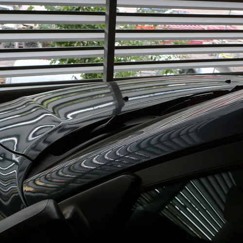
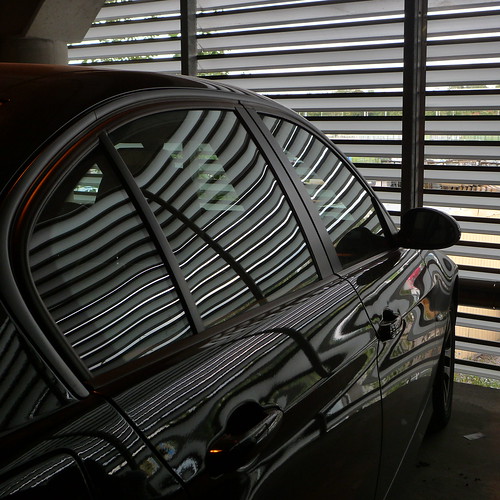
I couldn't decide which of the "stripe" photographs was better, or even any good, so I decided to include both. How you feet about them?
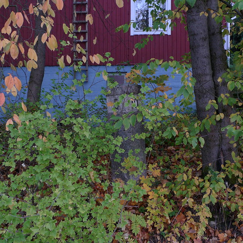
And as a bonus, a photograph which is much more calm - taken late evening at about sunset.


Big Weeds
17 hours ago
6 comments:
For me, Stripes2 is much better, both the composition and those intriguing red stripes against the black.
Stripes 2 definitely, its a much stronger composition.
Agreed. Stripes(1) has too much distraction (vegetation, red) in the upper half.
Thanks for being such an assiduous poster.
See my photoblog at
http://blog.lib.umn.edu/victor/hereandthere
#2 is it for me, too. A bit like the art of an engineer: Taken away everything that does not add to the whole. In #2 that reduction to the essentials is really successful, as is the direction of the lines against each other and the reflection in the polished paint.
@everybody: You are so right. I was blind (or tired) not to see the obvious. But "sleeping over the night" (a Finnish saying) helped to clear up things.
It would be appropriate to label #1 with "WRONG" and #2 with "RIGHT", so obvious is the difference.
@victor: Nice photographs from Minnesota!
I like both. #1 is more abstract, and that is good, but #2 has a much more satisfying distribution of light and shadows. It's a tie.
Post a Comment