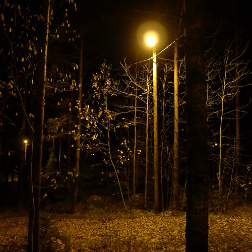
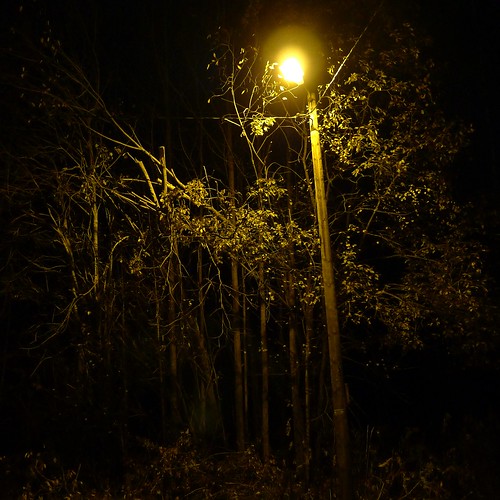
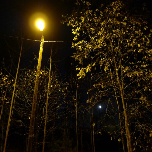
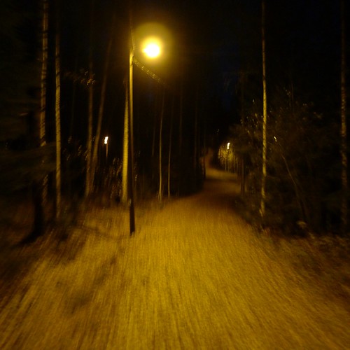
Yesterday I made a posting with b&w versions of photographs. Here you see how the color versions - the original ones - look like. As Martina suggested, the feeling is rather different. Which version do you prefer?
(Posting title is from My Life: A name trimmed with colored ribbons by Lyn Hejinian.)


4 comments:
It'a hard to say which I prefer. First I thought the coloured versions have more details, more dimension, but after opening them side by side in the browser I realised this isn't true. Just my imagination.
The colour is very controlling, indeed, since it is this hard artificial green/yellow.
In the end I asked myself which one I would print and frame and hang on a wall and it was the b/w version.
Strange, eh?
o doubt about it, the black and white versions win out.
Oops, that should say No doubt.
Martina, Cedric - thanks for the comments.
In addition there is the option of making tinted versions of the b&w photographs, or perhaps trying to desaturate the yellow in the original one. But I think I'm done with these photographs.
Post a Comment