Sven wrote an insightful comment to my posting on complexity, asking "Is this picture more about detail rather than complexity?"
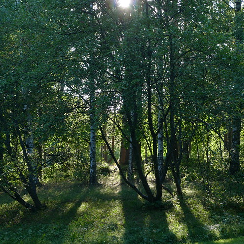
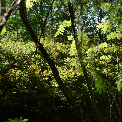
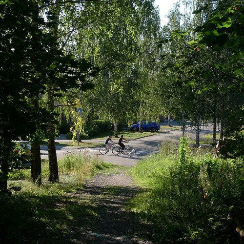
After thinking about this for a while, I must agree. I think these photographs are about texture - small-scale details repeating in a bit different form again and again. So, my difficulties in taking this photographs were self-generated - I should have viewed the subject as texture, not as a complex set of interacting objects. And when you deal with a texture, things become simple: how much of the texture to include, where to cut with the edges of the photograph, and that is all.
So here are three photographs, with which I tried to get on handle on what role texture plays in the complexity vs. simplicity question. I put these in the order of increasing complexity, but is my understanding correct?
May Day
14 hours ago


2 comments:
It is difficult to answer. If by "complexity" you mean the amount of detail in a scene, then white noise has very much complexity - but it makes for lousy photos.
The best answer I have is this: Let's first look at the interesting parts of the photo. This is what you select to carry the photo, what you want the viewer to see. Anything that isn't interesting is junk and may be very complex, but ultimately it is just a distraction.
Then, consider complexity to be the extent to which fine detail make up the interesting parts. That is, if the photo is designed so that the viewer focuses on fine detail, it is complex - if the viewer focuses on bold strokes it has low complexity.
With those definitions, you have the shots exactly backwards, according to my subjective opinion:
1. The first shot is very complex, because the interesting area is the whole photo, and the subject is the interaction of the sun's rays with the grass and the leaves. (Very detailed.) I like it a lot.
2. The second shot has two bold strokes - the dark trunks in the foreground. The background has detail, but is utterly uninteresting. Low complexity. I would have made the background more out of focus, just to keep it from getting any attention.
3. The third shot is two people on bikes, taking up 1/20th of the frame, and looking like detail-less cartoons - the rest is junk. Very low complexity - there is just nothing interesting to be seen here.
Mind you, art is subjective, so if you disagree you are probably right.
Thanks for a well articulated, extremely insightful and thought-provoking comment. And I don't disagree except to some little degree.
In retrospect, I relied too much on reason and too little on instinct when rating the photographs in terms of complexity.
Indeed, the human stick figures are far from complex, but my theory was that having humans in a photograph makes it complex. Theory disproven, so I need to unlearn this thinking. (Although it may be that there are exceptions, and a need to unlearn some of this unlearning at some future moment.)
In the second photograph, I was captivated by the blueberry leaves, and my idea was to put something in front of them to make the photograph a bit more interesting.
But as you note the thing in front was interesting in itself. And perhaps putting the blueberry leaves out of focus would have brought out the play of color there even better than now when they are in focus.
And yes, the first photograph is definitely the most interesting one in terms of internal structure.
Post a Comment