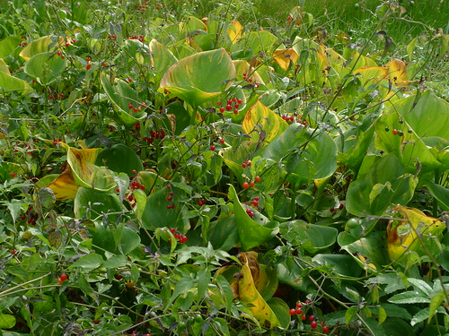
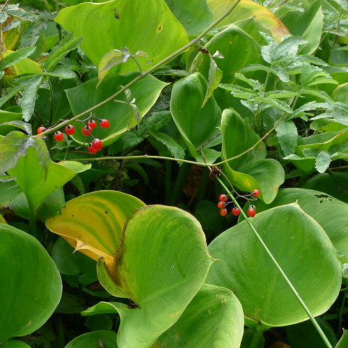
There are some unusual sights this time of the year, thanks to an exceptionally hot summer so far. Because it has been hot and dry, there has been much less water in streams, which has provided opporturnities for some plants which usually wouldn't cope so well. And some plants which need lots of water have difficulties, and their leaves are yellowing already.
Here is one such scene, where marsh calla is being overwhelmed by poisonberry. (Incidentally, the Finnish name for poisonberry - "punakoiso" - doesn't give any hint of the danger of eating the nice-looking berries. Fortunately they taste bad.)
But the problem is - how should you tackle such a scene in a photograph? How can you make a photograph which conveys the complex beauty of the scene, without making the photograph appear chaotic and very hard to view?
I don't know the answer, except that you can try to isolate a detail. But then you lose the complexity.
Very Early Spring
17 hours ago


5 comments:
I love all three shots!
Is this picture more about detail rather than complexity? There are only two referents: the marsh calla and the poisonberry. The subject is "poisonberry overwhelming the marsh calla".
I think people have been conditioned (via many advertising style images) for simple images. There is a place for complex images; for people prepared to spend more than 2 seconds looking at an image to form an understanding of it.
Thanks for the comments!
Indeed, it probably is true that this is a case of a simple thing happening all over the photograph.
For me it was very difficult to start taking photographs of the scene, as I couldn't form an idea what should be included and what shouldn't.
Your problem is that the berries, although standing out when you view the scene in real life, disappear in the photo. This happens a lot - when we look at a scene with our eyes, we tend to see something interesting and automatically filter out everything around it. Unfortunately, the camera doesn't, and the photo ends up having a lot of junk in it.
A couple of things that I've found helps in these cases:
1. Perhaps obvious, but: If you want to show a lot of small things in one photo, you have to PRINT BIG. 500 pixels wide will make a berry about one pixel, and the whole shot a couple of inches across. There is just no way to show intricate complexity in that format.
2. Get closer and try to pack as many berries as you can in a smaller frame. That way, each berry gets more space and makes more of a visual impression. Include enough calla for the viewer to think "lots of calla". You don't have to show the edges of the calla - just fill the frame. In your second and third shots you zoom in on areas with *few* berries, yet it is the *amount of berries* you want to show.
3. Wait for better light.
3. a. During the golden hour reds stand out more.
3. b. It looks like the weather was cloudy when you shot. Contrast is reduced then.
@Anonymous: Thanks for the detailed and helpful comment.
When I took the photograph, I was happy about the clouded weather, thinking that it would bring up the scene better, but I agree that perhaps stronger sunlight could have worked with this scene.
And printing big is an intriguing idea - perhaps which could fit on the wall at home... Have to think about it.
Post a Comment