

Today was once again a hasty day, and there was little time for photography. But you take what you can get...
I'm following dozens of photography blogs in Google Reader, most of which I seldom visit, but one of these caught my eye today, because the posting title was something which I have been thinking off and on for quite a while: "Relating To and Learning From Other Photographers".
But I got rather disappointed, first because there was a comparison pair of photographs, the other original and the other heavily photoshopped by the author of the posting. I preferred the original, even though it contained a basic mistake, a pole sticking from the bottom of the frame.
The photoshopped version was oversaturated, manipulated, looking like a Disney version of the real world. Or that was my impression. Maybe this reaction was caused by having discussed "pretty pictures" recently.
The second thing which bothered me about the posting was a sort of condescending tone. And even though I agreed with a lot of the points, I disagreed with the way they were presented. And it was rather ironic that the following advice was given in the posting: "Remember, we were ALL in the same place of the learning curve at one time or another, so no condescension!"
Well, I'm not so polite or non-condescending here either, as I'm sure you have noticed. Not to say anything about being cranky, morose or just plain obtuse. But it is sad to see how people try to get into the spotlight, not realizing that it is the doing which matters, not the results, fame, or anything of that kind.
Coming back to the topic of "Relating To and Learning From Other Photographers", David Bayles and Ted Orland nailed it in their book Art & Fear: Observations On the Perils (and Rewards) of Artmaking (Image Continuum, 1993). I have mentioned this book before, but it really is that good.
In the book the authors give instructions under the title "Operating Manual for Not Quitting". Part A of the recipe is "Make friends with others who make art, and share your in-progress work with each other frequently." Part B of the recipe is that the colleagues indicated by Part A are a much better target audience for your photographs than, e.g., aiming to have your photographs hanging on the walls of a museum of modern art.
And that is why photography blogs are such a great thing. (Also that photography blog of which I was so critical earlier in this posting.)


More Spring, 4/22/26
1 day ago
8 comments:
I completely agree with you in preferring the original to the photoshopped version. The degree of contrast and saturation in the image is to some extent a matter of personal taste - and since, if I recall correctly, I stumbled upon your blog via The Landscapist, it's probably no great surprise that I also have a preference towards realism. The high-contrast, high-saturation version may well be closer to how the photographer felt (as opposed to saw) when he was there, though, in which case it's understandable that he manipulated the image to look like that. (It's possible that he just wanted to make people looking at it think "wow! that picture really pops!" - but I'm willing to be charitable here.)
The removal of the power line and pole is something I'm more uncomfortable with. It seems to move the picture more into the realms of fantasy, if not outright lie - as you put it, a Disney version of the world. I tend to assume, when viewing something that looks like an ordinary photograph, that objects present in the picture were present at the time the photo was taken, and vice versa. After learning that this isn't the case I tend to feel a bit cheated.
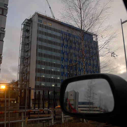
First about the "pretty pictures": I am glad that you included the "Building" with two birches in this post - while the hoarfrost images have their qualities and are beautiful and inviting, "Building" is more like beauty with a twist, and in my eyes is a much more faithful urban beauty than the photoshopped "Shiprock" image on beyondmegapixels.
I agree that this really is overcooked. As an example for good photography it's a failure in my eyes, but if I understand it correctly, it was mainly the attempt to rescue a third person's image - which seems to have been flawed from the very first moment by an inadequate position for a "grand landscape" image.
Regarding sharing, learning and collaboration: For me, too, electronic media have been a breakthrough in communications with like-minded photographers, where I can peep, lurk, discuss and learn and train my eyes and vision. It would be very difficult to start and maintain prolific personal contacts with other photographers when already splitting time between work and family.
Re. the beyondmegapixels post: Too many words on obvious things in a style that I too would mark as condescendent. I have the feeling it was written to rise the hit rate for the blog by providing easy to index content, something that pure picture posts won't do. Not for everybody the path is the goal.
"Fallen" is stunning, it shows just how much vision and skill you have when you use that LX5.
@Cameron: As noted by Markus, this was a case of a photographer photoshopping a flawed photograph taken by another.
Wow! seemed to be the target.
As to the "reality" of photographs, compared to seeing with your own eyes, it is good to remember that what we see is at best a 2.5 dimensional sketch of the world, many things invented by the brain to fill the gaps. (The bandwidth from the eyes to the brain is really, really small.)
In a way, our brain is engaged in large-scale photoshopping all the time, without us realizing what is happening. Magicians are good at taking advantage of this.
@Markus: "Building" was my favorite as well.
And indeed, that posting at beyondmegapixels was for sure "hit bait".
@Colin: I should have gone out earlier to have had time to take some more photographs. But maybe next week we'll have frost on the ground again.
Agree about "Building". Cleverly taken and great use of juxtaposition.
As for the beyondmegapixels post I don't have much more to say then what has been said but for the observation that I have no interest these days in such writing. I find "bullet point" style of writing as lazy and unimaginative. Also I would add that trying to learn photography in the manner of this particular blog is simply not for me though it may well be for some. I have gotten much more inspiration from you Juha and people like Andreas Manessinger, Paul Maxim, Paul Lester et al.
@Cedric: About the "Building" photograph - it was taken while I got stuck in a long queue of cars near a construction site, waiting for the road to clear. At first I was impatient, but then I noticed the view ... I almost lost track of time.
Post a Comment